Ultra Violet: Pantone Color Of The Year
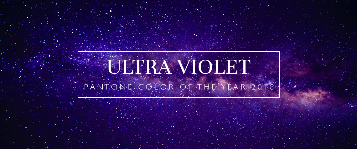
Pantone has announced its Color of the Year for 2018, and we’re delighted to see that our predictions were correct – make way for Ultra Violet, a dramatic and thoughtful shade of purple.
This provocative colour lights the way for the next twelve months, highlighting the spontaneity and originality that we crave. Pantone 18-3838 Ultra Violet is visionary and inventive, complex and contemplative. It channels mystery, myth and artistic flair. It inspires us think big and pursue a wider world. Want to know more? Read on…
Back in November, our interior designers predicted that purple was a strong contender for next year’s reign: “The shade we envisage is true purple; a vibrant, even balance of red and blue, the sort that you’d associate with modernity, mysticism and dance music. Our reasoning for purple is owed to the current reinvigorated wave of feminism, coupled with our desire to try new things and reach beyond the traditional neutrals and primaries.”
Pantone has confirmed this. Following on from the release of Prince purple earlier in the year, honouring the international pop icon, Pantone have crowned a brighter hue of purple the king of 2018. They explain that Ultra Violet is an enigmatic symbol of counterculture and creativity, symbolising “experimentation and non-conformity, spurring individuals to imagine their unique mark on the world, and push boundaries through creative outlets.”
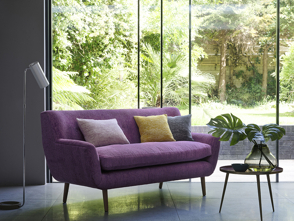
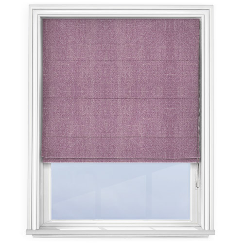
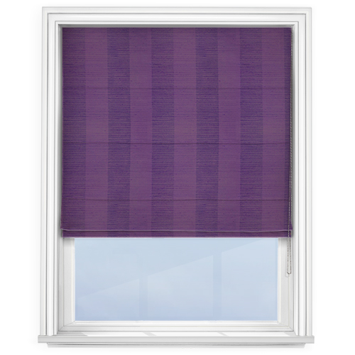
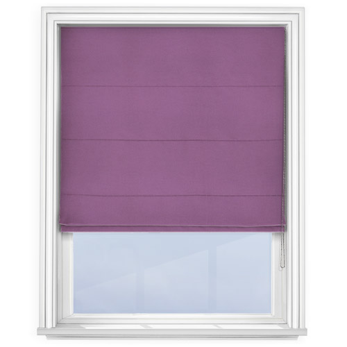
You may be surprised to learn that Ultra Violet can be incorporated effectively into a number of colour palettes. Despite its vibrance and drama, it is a versatile shade of purple that lends itself to both neutral and bright schemes.
“The color is often associated with mindfulness practices, which offer a higher ground to those seeking refuge from today’s over-stimulated world.”
Create a statement with Ultra Violet by placing a statement piece of purple furniture upon a slick, simple backdrop. An otherwise monochrome and minimalist space can be instantly brightened up by this unusual addition, especially when paired with contrasting soft furnishings and accessories.
Sticking with neutrals throughout the rest of the space allows Ultra Violet to do the talking. Warm shades like taupe, almond, beige and coppers work very well, contrasting the cooler blue tones of the colour. But cooler neutrals provide an equally effective combination, particularly lilac, grey and silver. Teal and sea blue are a more unusual pairing with Ultra Violet, offering a mysterious and strong palette. Meanwhile, orangey-red and peach can be teamed with Ultra Violet for a radiant colour combination that conjures images of sunsets and North African decor.
“The use of purple-toned lighting in meditation spaces and other gathering places energizes the communities that gather there and inspire connection.”
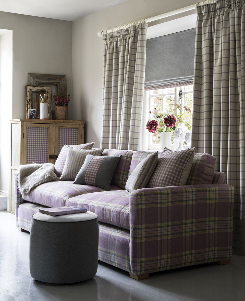
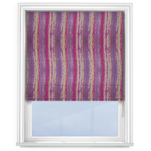
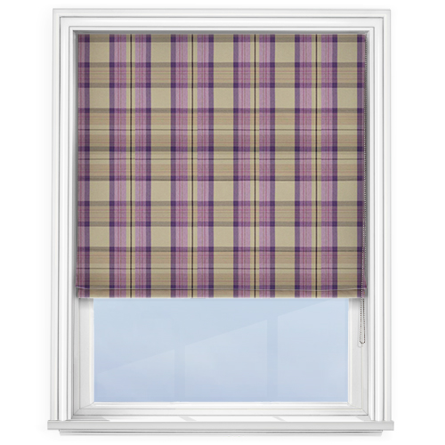
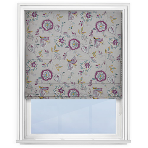
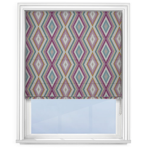
In terms of prints, Ultra Violet’s modernity makes it an interesting addition to classic patterns. When paired with softer purples, beige and green tones, it makes for a charming tartan. The shade also works well with cool cream as a basic check, or with feminine pinks and yellows for an abstract Geo print. Of course, florals are an excellent choice with Ultra Violet in mind; this tone of purple offers a mystical edge to traditionally girlish prints, helping to bring botanicals back with serious power.
We’ve selected some of our favourite Roman blinds that showcase the beauty and versatility of Ultra Violet in the home. Click the images to shop.
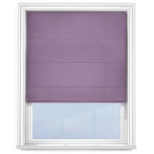
Discover our full collection of purple Roman blinds here. You can also take advantage of our FREE Interior Design Service by contacting our Interior Design Specialists directly: [email protected] or 01924 848739 (8:30-4:30 MON-FRI)
