Peach Echo: Spring – Summer Weekly Colour Report
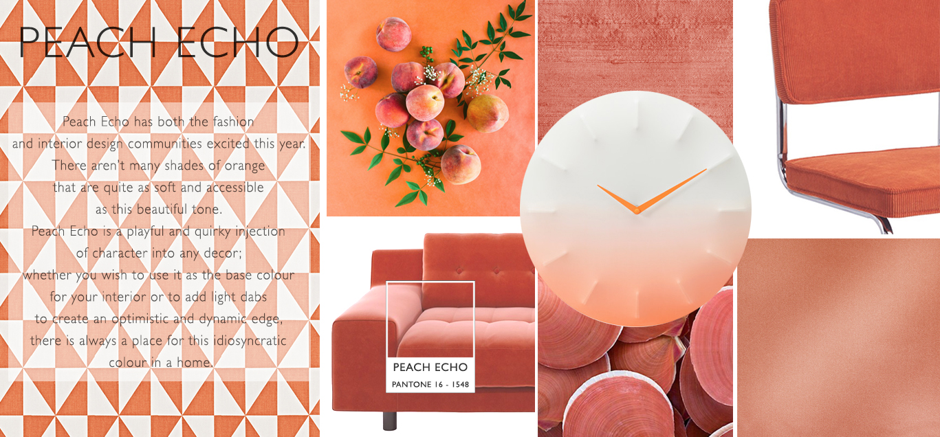
If you are looking to add an element of spontaneity to your interior, then look no further than the quirky shade of Peach Echo.
Chosen as one of Pantone’s spring 2016 colours, this gorgeously gentle shade of orange is a soft complement to any room. Pantone’s spring colour palette abounds with variety, and gives interior designers the chance to mix and match Peach Echo with a fabulous array of different shades and tones.
Although a gentle and enriching shade, Peach Echo simply will not be ignored; no matter which colours you choose to coordinate or contrast it with, and despite being an ultra-stylish colour, it has a childlike simplicity that creates a playful atmosphere. It is a sure bet for adding warmth and optimism to your home decorating ideas.

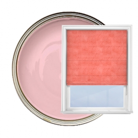
Complement Peach Echo with accessories in a similar shade of orange, such as cushions made from our gentle Prestigious Polo Peach fabric. The soft elegance of Jaipur Dark Rose is the perfect accompaniment to the vibrancy of Peach Echo, especially when this delicate and sumptuous fabric adorns your window as a pair of curtains, radiating a warm and welcoming ambience.
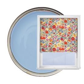
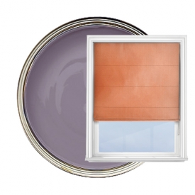
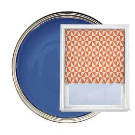
Mix and match Peach Echo with the deeper tone of Snorkel Blue to add a stark and stylish contrast to prevent your interior from becoming bland. A dab of Rose Quartz here and there is a feminine touch, while the calm shade of Lilac Grey provides the perfect base colour to keep your room grounded amidst all the brilliant oranges and pinks.
White furniture and gold decorations such as mirrors and picture frames lend a classic elegance to your decor. When used sparingly, striped fabrics like Cameo Indigo or Studio G Alibi Summer are perfect for jazzing up your interior to add a tasteful yet modern edge.
Our interior stylists have been pinning! For more design ideas, home inspiration and information on Peach Echo and Spring – Summer 2016, take a look at our Pinterest boards.

