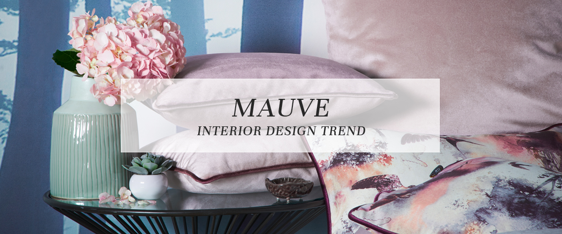
Mauve Interior Design Trend
Pantone’s colour for 2018, Ultra Violet, has inspired a surge of purple tones throughout our homes.
From pale lilac and periwinkle to deep grape and aubergine, there are plenty of variations of this reddish-blue to choose from. Today, we’re going to take a closer look at mauve, one of the leading purple shades of the season. Read on to find out more…
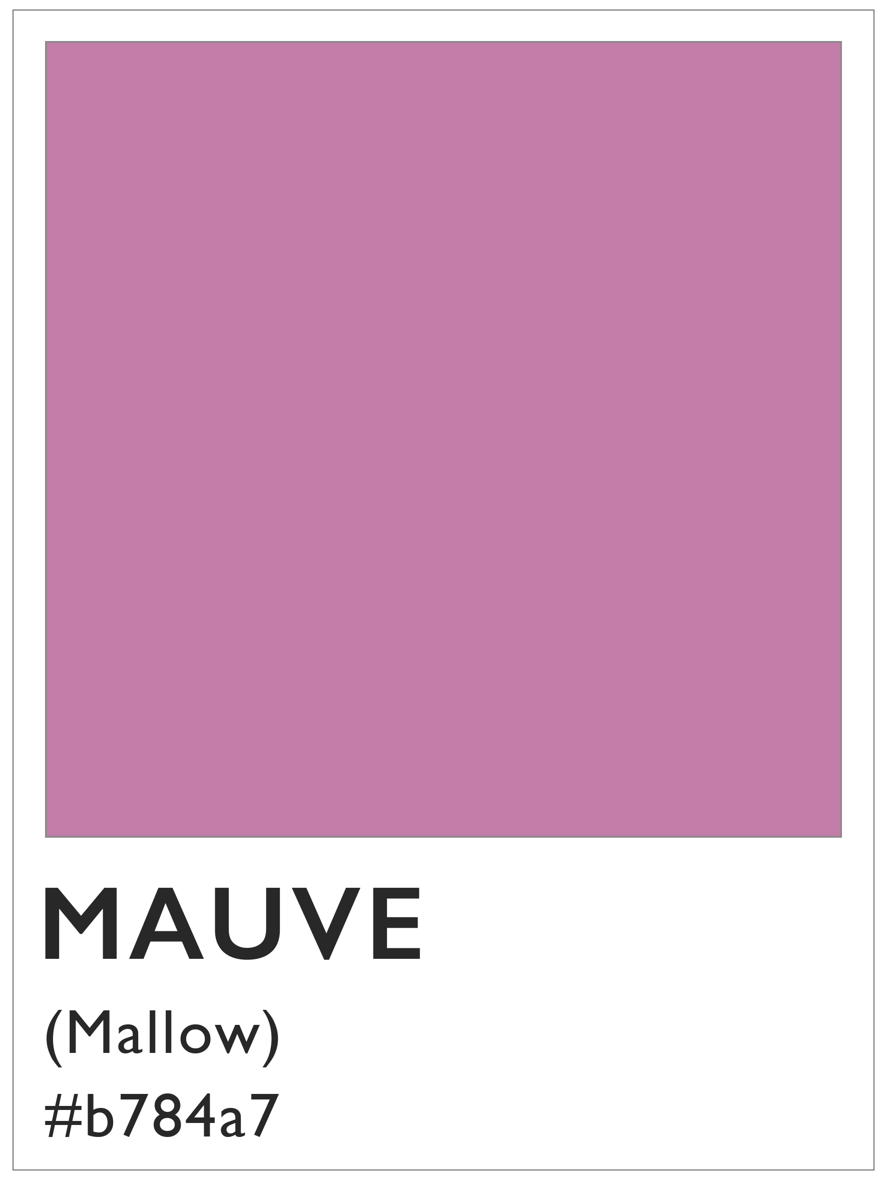 The colour mauve
Mauve is named after the mallow flower, which is ‘mauve’ in French. It is mix of blue and magenta with high levels of grey, creating a hazy purple shade.
While blue-based tones are inherently peaceful and reflective, with red comes an added sense of creativity and drama. Mauve also walks the line between femininity and masculinity, offering strength and grounding with a romantic air. When we look at mauve, we can notice these contrasts, along with the injection of greyness that pulls it into a neutral palette. This makes for a more relaxed and versatile shade of purple.
The colour has a rather interesting history. The accidental result of a chemist experimenting with hydrogen, oxygen and coal tar, mauve was the very first synthetic purple. It was first named Tyrian Purple, then renamed to mauve to sound more trendy. The invention was a huge deal; until now, the colour could only be made with natural dyes, so it was very expensive and only be enjoyed by the wealthy.
How to use mauve in your home
There are a number of ways to work mauve into your home for a warm and stylish effect. Its neutrality makes it a good base colour for a room, toning well with deep damson and berry tones to lift the scheme. Mauve can also be mixed with other muted tones of pink or blush, as well as sorbet cream and pale pistachio greens. This combination makes for a subtle palette reminiscent of macarons and ice-cream.
Mauve will make your home feel snug and comfortable, especially when mixed with warm beige, linen and other soft natural tones. Of course, if you prefer a deeper, more dramatic effect, consider pairing mauve with bold jewel greens, turquoise and teal, or dark midnight blue. The added beauty of mauve is that it will tone well with any shade of grey, from the lightest dove through to the darkest charcoal, which always helps to pull your design scheme together.
When it comes to accessories, mauve can be highlighted with all gold toned metals, including brushed gold and the pinker toned rose gold. For more inspiration, look at Dulux’s colour of the year, Heartwood. This warm neutral has a subtle lilac tone and is incredibly versatile.
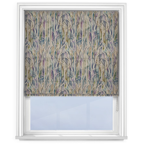
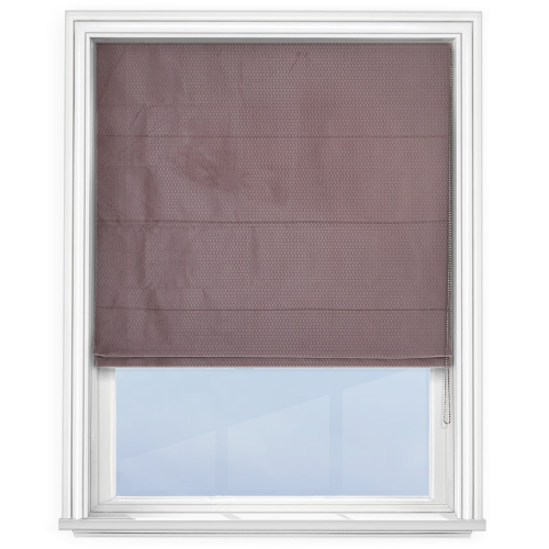
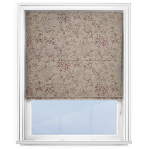
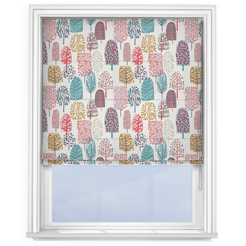
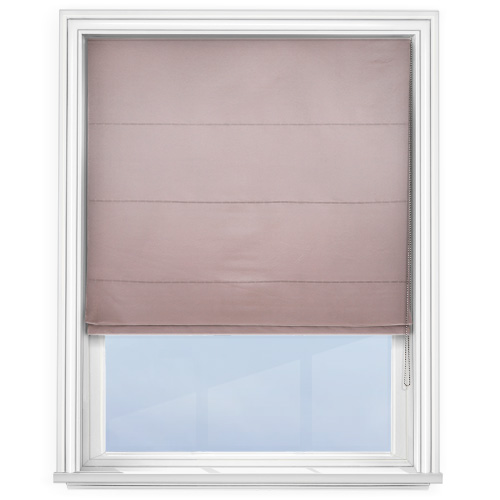
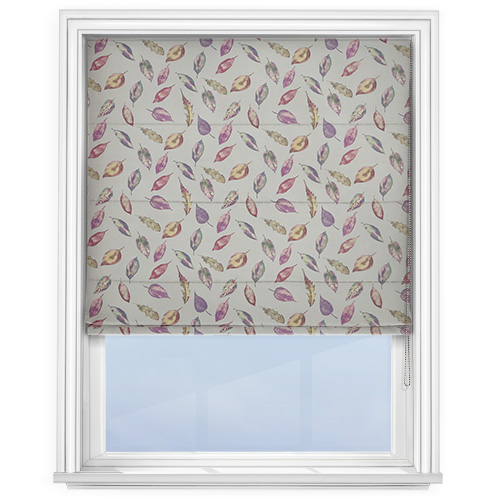
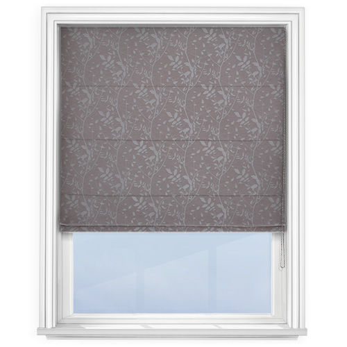
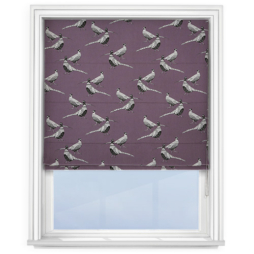
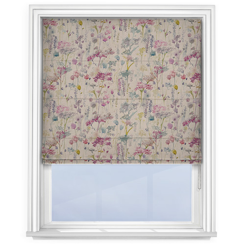
Shop mauve Roman blinds
We have a great range of mauve styles at Roman Blinds Direct, from sophisticated shades in sumptuous textures, to fun designs with pops of purple. Simply click the images to shop!
Make more of your windows with a high quality, made to measure Roman blind from Roman Blinds Direct. If the mauve trend isn’t right for you, you can choose from a wide range of other colours and designs. Want to know more? Get in touch with our team for more information.
