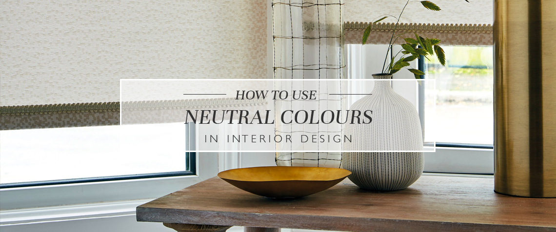
How To Use Neutral Colours In Interior Design
Neutral interiors needn’t be bland. In fact, a softly toned, earthy style is one of the most effective themes for creating a calm and welcoming space.
What are neutral colours?
Colours sit in one of three groups: the active group, the passive group, and the neutral group. Active colours include red, orange and yellow-based greens. Meanwhile, passive shades include teals, blues and cooler shades of purple. Neutrals, on the other hand, aren’t found in the usual colour wheel. They are created by mixing two shades such as green and red with white and/or black. This makes for a soft and subtle earthy tone like olive or taupe.
Neutral colours are inherently impartial, making them a versatile choice for the home. Understated and unbiased, they will tie in with a range of different interior schemes, no matter your tastes. Neutrals are most often considered as effective backdrops. They offer the perfect starting point for your space if you’re looking to create a stylish minimal look. Neutrals will also provide an anchor for brighter shades and bolder patterns if you’re keen to create a more exciting look. But along with being great backdrops, neutrals can be statements in their own right.
How to use neutral colours in interior design
Neutrals are a reliable decorating choice. They work well in contemporary spaces, complementing the straight lines and modern design accents. Of course, neutrals are also a great option for traditional styles, especially when paired against exposed beams, sumptuous fabrics and dark wood furniture. The best thing about neutral colours is that they can be applied anywhere. They are supportive of all design styles, from the classic or kitsch to the retro or ultra-modern. If you want to incorporate fresh neutrals into your own home, start by considering your palette.
A neutral colour palette will consist of numerous shades, and there’s no limit to the range you choose. Of course, you must remember to combine carefully to achieve your desired look. For instance, touches of terracotta, peach and ecru upon a beige backdrop will work beautifully to create a neutral earthy space, but introducing slate grey or blueish white to the design would throw the whole thing off kilter.
You needn’t feel limited by the usual suspects of pure white and grey. Instead, amp up the energy with richer tones and higher saturations. Muted greens, purples and oranges are wonderful neutrals and can work wonders in softening and warming up a space.
Neutral tones may be relaxing and unobtrusive, but they can also be energetic and stylish statements. The key to impactful neutrals is a careful combination of complimentary tones. Remember that you can inject more fun to your interiors with different textures and patterns. The tactile elements of a space are often overlooked, but when it comes to natural hues, it’s the textures that do a lot of the talking. So explore the potentials of soft wools, thick knits, brushed velvets and smooth glosses – each of these textures will bring a whole new level to your interior design.
Neutral interiors inspiration
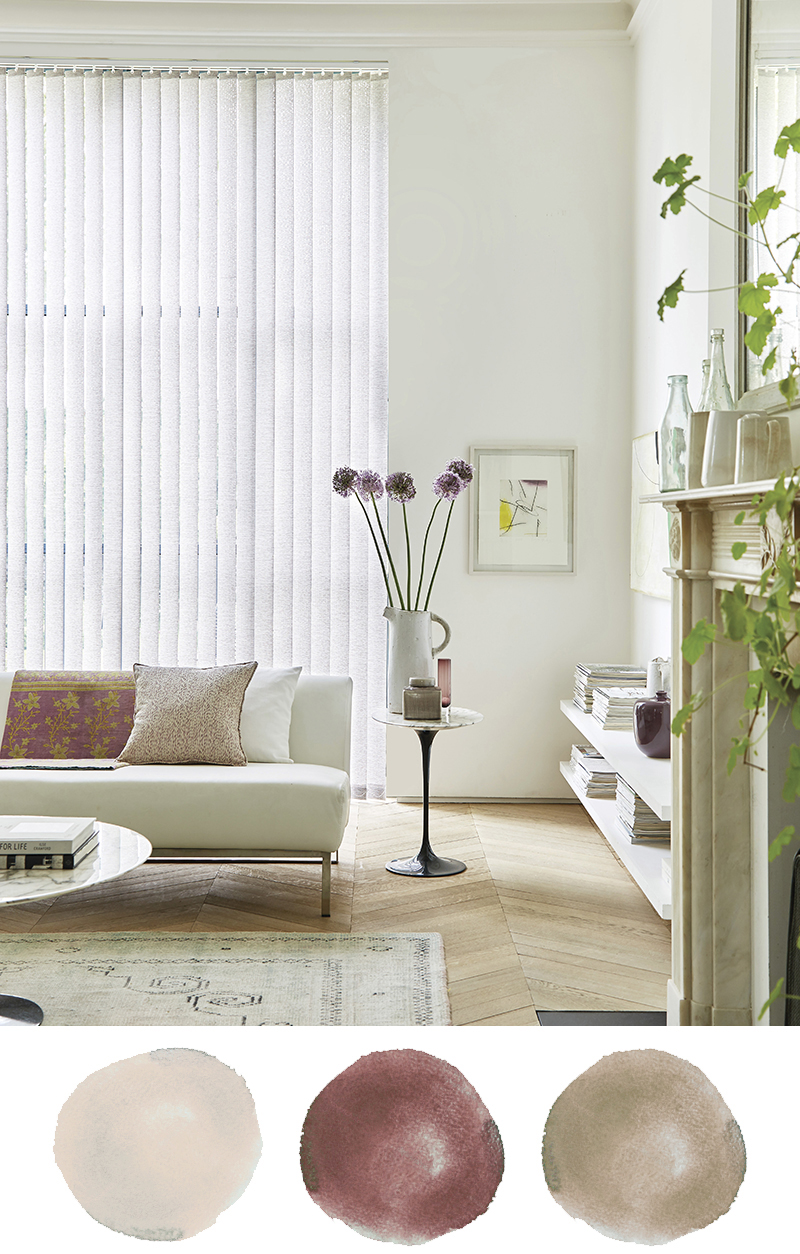

1. This neutral interior design scheme layers natural materials and earthy tones upon a cream-coloured base. Moroccan-inspired textiles and prints bring character to this room, along with the pottery, glassware and greenery that keeps things fresh and bright. This North African artisanal twist works beautifully, especially alongside the simple modern furniture and window dressings. Get the vertical blinds here.
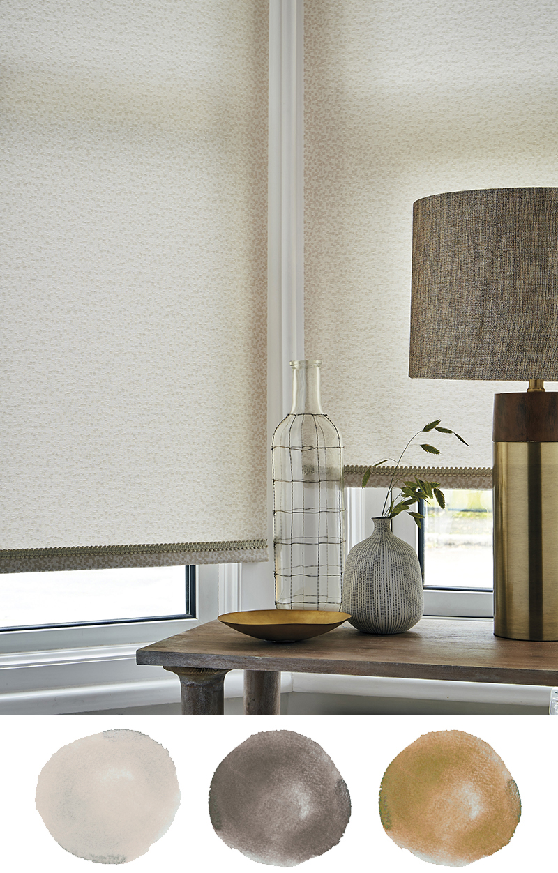
2. Warm woody tones and metallics are a delightful addition to this neutral colour scheme, which focuses on warm beiges. This simple base is punctuated by interesting design accents and textures, though the tones never stray far from neutrals. Instead, the materials do all the talking, from the shining contrast lamp to the rustic rubbed table. Dappled roller blinds are another lovely touch (you can get your own roller blinds here).
3. This neutral room strikes the right balance between simplicity and interest. Plain white walls are warmed up by a real wood floor, biscuit-coloured furniture and geometric textiles in various neutral tones. Layering up these patterns and shapes is a wonderful way to bring excitement to a space that’s free from colour. Replicate the window dressing look by exploring our collection below.
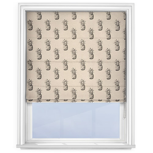
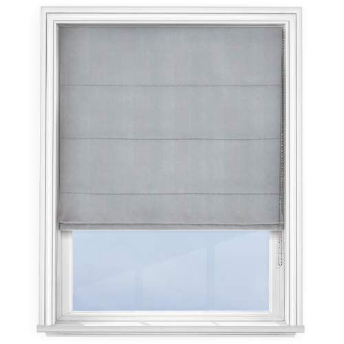
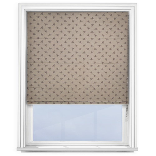
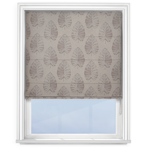
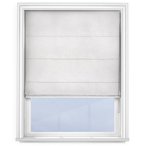
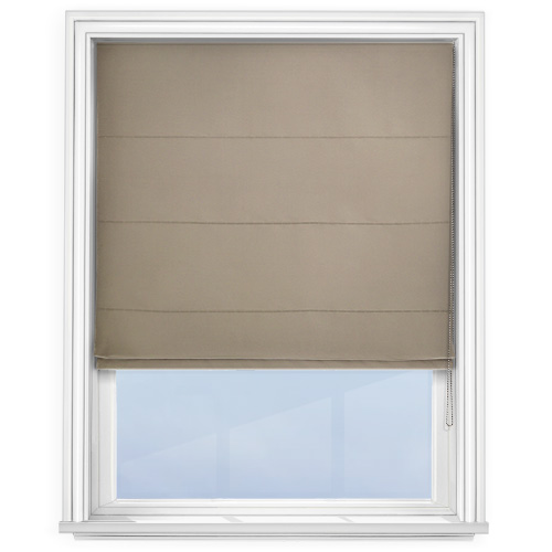
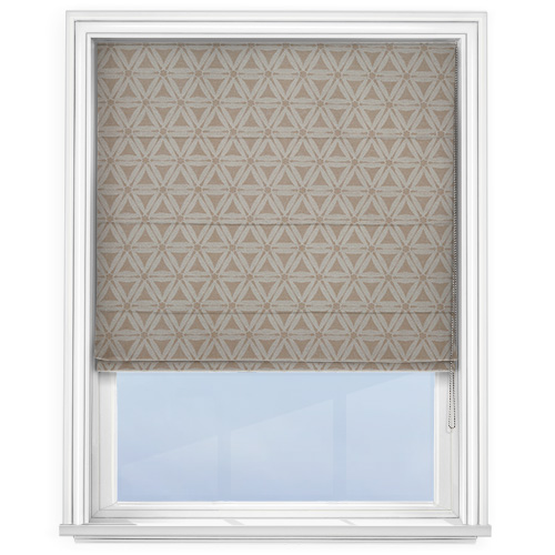
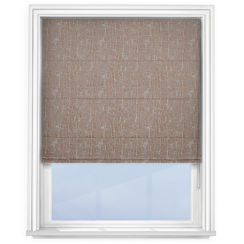
Get neutral Roman blinds
Feeling inspired? Here’s a selection of some of our bestselling neutral Roman blinds, the perfect window treatment for any neutral space in your home. Which is your favourite? Click the images to shop!
Do you feel inspired to try new neutral interiors? Take advantage of our FREE Interior Design Service by contacting our Interior Design Specialists directly: [email protected] or 01924 848739 (8:30-4:30 MON-FRI)
