Warm Taupe: Autumn – Winter Weekly Colour Report
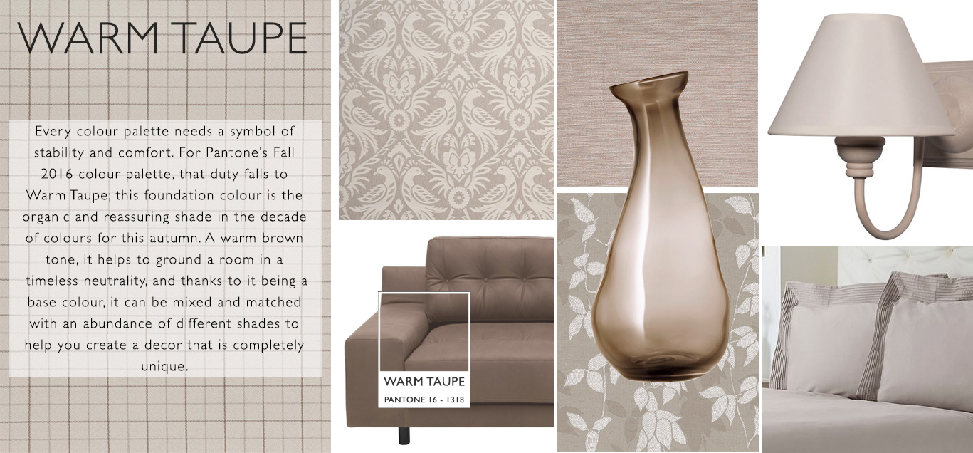
We like to consider Warm Taupe to be the parent colour in Pantone’s Fall 2016 colour palette. In another decade of diverse colours, this is the shade which says to all the brasher tones: “You’re grounded!” Whatever room design ideas you may be nurturing, there will always be a need for a shade that brings a room back down to earth, and in Pantone’s Fall 2016 palette, Warm Taupe holds that responsibility.
The maternal instinct of Warm Taupe doesn’t end with its grounding properties, however. This timeless shade of brown offers support and complementary class to any colour in any decor, thanks to its organic and natural aesthetic. It provides a room with a reassuring ambience of warmth and calmness, creating an intimate sanctuary of on-trend style.
While some colours in Pantone’s Fall 2016 palette, no matter how stylish, simply do not belong in the same room together, Warm Taupe is a friend to all shades, weaving its beauty between each colour and helping to complement all of them in a unique way. In the fourth edition of our Autumn – Winter Weekly Colour Report, our room inspiration includes a diverse range of colour and some ultra-stylish fabrics, so let’s get started.
As a base colour, we recommend a liberal application of Warm Taupe to your walls; use paint rather than wallpaper so you can see the brush strokes. This will create a textured look that will enhance the earthy and organic atmosphere.
Natural wooden floorboards coordinate with the rustic look, but to add a little variation that prevents the room from being overpowered by different shades of brown, our interior stylists recommend that you include a rug in a differing colour – the dusky pink shade of Dusty Cedar would be a perfect, subtle contrast to the floor, lending a little femininity to the rural vibe.
Creamy-coloured wood that is just off-white is a chic accompaniment to Warm Taupe; we suggest investing in a cabinet in this shade as it will subtly stand out from the walls, but not so much that it creates a stark clash in your living room.
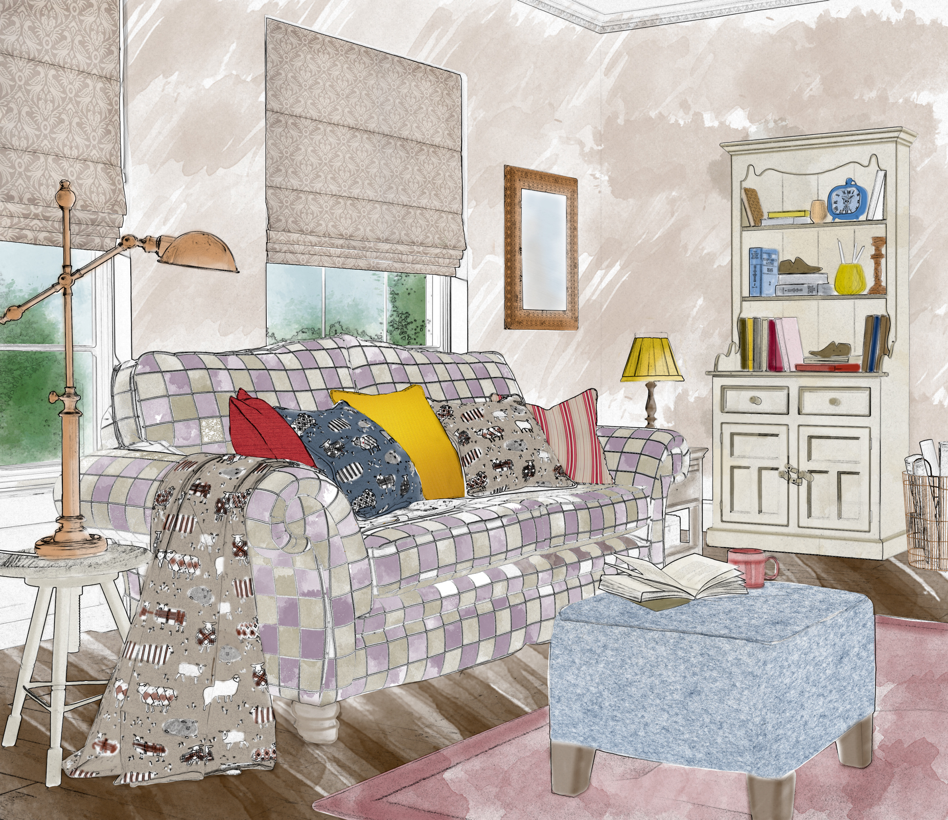
We are reviving a blast from the Pantone past in this week’s article, bringing back one of our favourite shades from their spring palette, Lilac Grey. The neutral yet edgy hue of this off-purple base colour is a subtle touch of avant-garde class to help diversify your Warm Taupe interior. Lilac Grey would be the ideal incorporation as a fabric for your sofa, lending a cool contrast to the Warm Taupe walls.
Airy Blue is another shade to consider. A weightless and ethereal shade, it coordinates gorgeously with Dusty Cedar, and would be a tastefully enchanting inclusion in the form of a pouf or floor cushion, placed in the centre of the room on the rug, in front of the Lilac Grey sofa.
To best complement these particular room design ideas, our interior stylists selected Clarke & Clarke’s Harewood Linen as the ideal fabric. A brown roman blind, its shade is almost an exact match to Pantone’s Warm Taupe tone. It is made from a composite of cotton, linen and polyester, giving a really luxurious feel, and features a detailed pattern that adds real sophistication to any room in the home.
Liven up the living room with a dash or two of Spicy Mustard, which should be used sparingly, for example, as a lampshade and the occasional cushion, sparking a bright focal point in the room. For the ultimate diversity, inject a darker, cooler cushion, such as that of the navy blue shade of Riverside, to add a small but powerful depth to the sofa that will lend a striking dissonance that exudes class and sophistication.
Our stylists selected iLiv Baa Baa Peony as another must-have fabric for a Warm Taupe interior. Invest in one or two cushions in this flowery sheep pattern, which incorporates a wide assortment of patterns. Why not have a throw made out of it for the back of your sofa, too?
And finally, gold and brass accessories, such as mirror frames, magazine stands and table lamps will create a classic charm that coordinates beautifully with the muted brown tones.
Our interior stylists have been pinning! For more room design ideas and information on Spicy Mustard and Autumn-Winter 2016, take a look at our Pinterest boards.
For more interior design news, room inspiration and images, keep checking our Twitter, Instagram and Facebook pages, as well as our unique hashtag: #igdtrends.
