Potter’s Clay: Autumn – Winter Weekly Colour Report
The leaves have turned, the nights have drawn in and the temperatures have plummeted. There’s little doubt that it will soon be winter. It’s time to create a seriously cosy haven that is a joy to inhabit during the cold evenings at home – we can help you there. Our Weekly Colour Report is bringing you a warn dose of earthy room inspiration this week, showing you how to fashion a snug sanctuary using the glowingly gorgeous shade of Potter’s Clay.
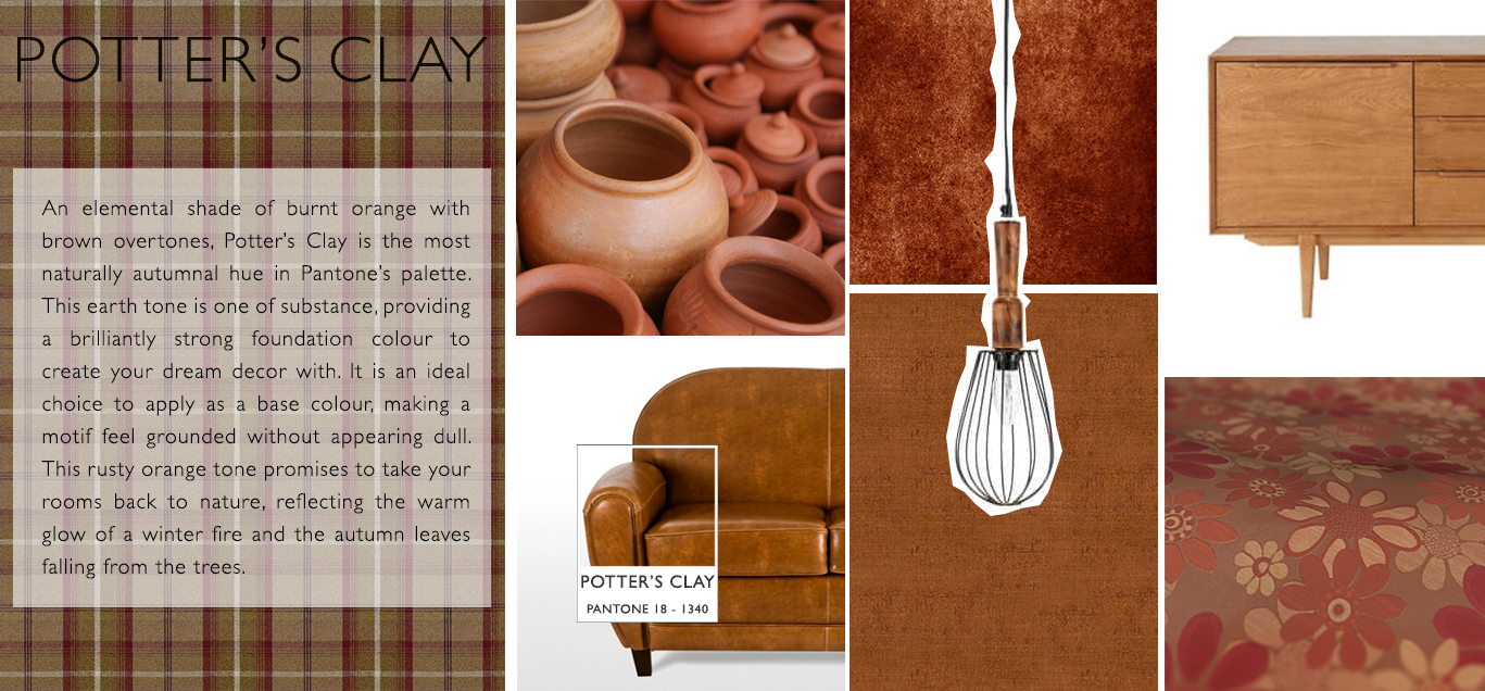
This russet orange tone is a beautiful embodiment of the glow of autumn leaves and the ruggedness of tree bark, making it the ideal shade to incorporate into your wintry room design ideas. Potter’s Clay is a neutral earth tone that can be paired with a huge medley of colour to create a truly one of a kind decor. The ultimate colour for autumnal room inspiration, we have chosen a fantastically varied palette to accompany a Potter’s Clay living room, which is guaranteed to radiate warmth and joviality long after winter is over.
Even with deep tones of orange, there is always the risk of overuse, which has the effect of making a room appear too brash, even sickly. For this reason, our interior stylists would suggest using a softer shade for your base, such as the neutral colour of Warm Taupe, which pairs fantastically with Potter’s Clay. This subdued brown is just as autumnal in appearance, and provides you with a foundation to incorporate a multitude of colour.
Integrate wood to bring out an elemental side of your room inspiration. Wooden floorboards are preferential to carpets; the darker the wood, the warmer the atmosphere will be, which is particularly poignant at this time of year. Add furniture in dark tones of rosewood or mahogany to further enhance the natural warmth. Potter’s Clay is the ideal shade for styling a vintage motif, so wooden furniture will help to further magnify the rural charm of your decor.
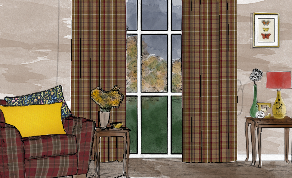
Curtains will add a classically chic charm to emphasise the vintage feel, and our stylist have selected Fryetts Balmoral Heather as the ideal Potter’s Clay fabric. This tartan design is perfectly suited to winter, giving your home the feeling of being in the Scottish highlands in a palatial space of peace and tranquillity. These curtains are a golden shade of Potter’s Clay, radiating warmth and class throughout your rooms.
Jazz up your interior by injecting some brighter colours. Contrasting tones of red and greens add a festive air that is both interesting and tasteful; armchairs in a checked pattern is a vivid and warm focal point to include, which will also subtly complement the checked pattern on your curtains. The closest shade you can get to Aurora Red, the more on-trend your interior will be; another of Pantone’s fall colours, this ruby shade of red gifts your home with a rich and provocative eye-catcher that will act as a warm contrast to the browns and oranges. Other highlights in red could include accessories like lampshades and throws.
Juxtapose these reds accessories in mustard yellow and lush green shades to spice up the room. These can be introduced to your home in the form of cushions, vases, rugs and artwork for the walls. For cushions, why not try out the simple design of Prestigious Lush Honey? This yellow cushion is a warm and striking colour that pairs beautifully with Potter’s Clay. Diversify with a patterned cushion in a Lush Meadow base tone, such as iLiv Cotswold Jewel.
Copper and brass embellishments such as picture frames table lamps and ornaments add a rustic dimension that enhances the vintage feel, and also pair very well with the wooden furniture.
Our interior stylists have been pinning! For more room design ideas and information on Potter’s Clay and Autumn-Winter 2016, take a look at our Pinterest boards.
For more interior design news, room inspiration and images, keep checking our Twitter, Instagram and Facebook pages, as well as our unique hashtag: #igdtrends.
