Mix and Match Pantone Colours Of The Year
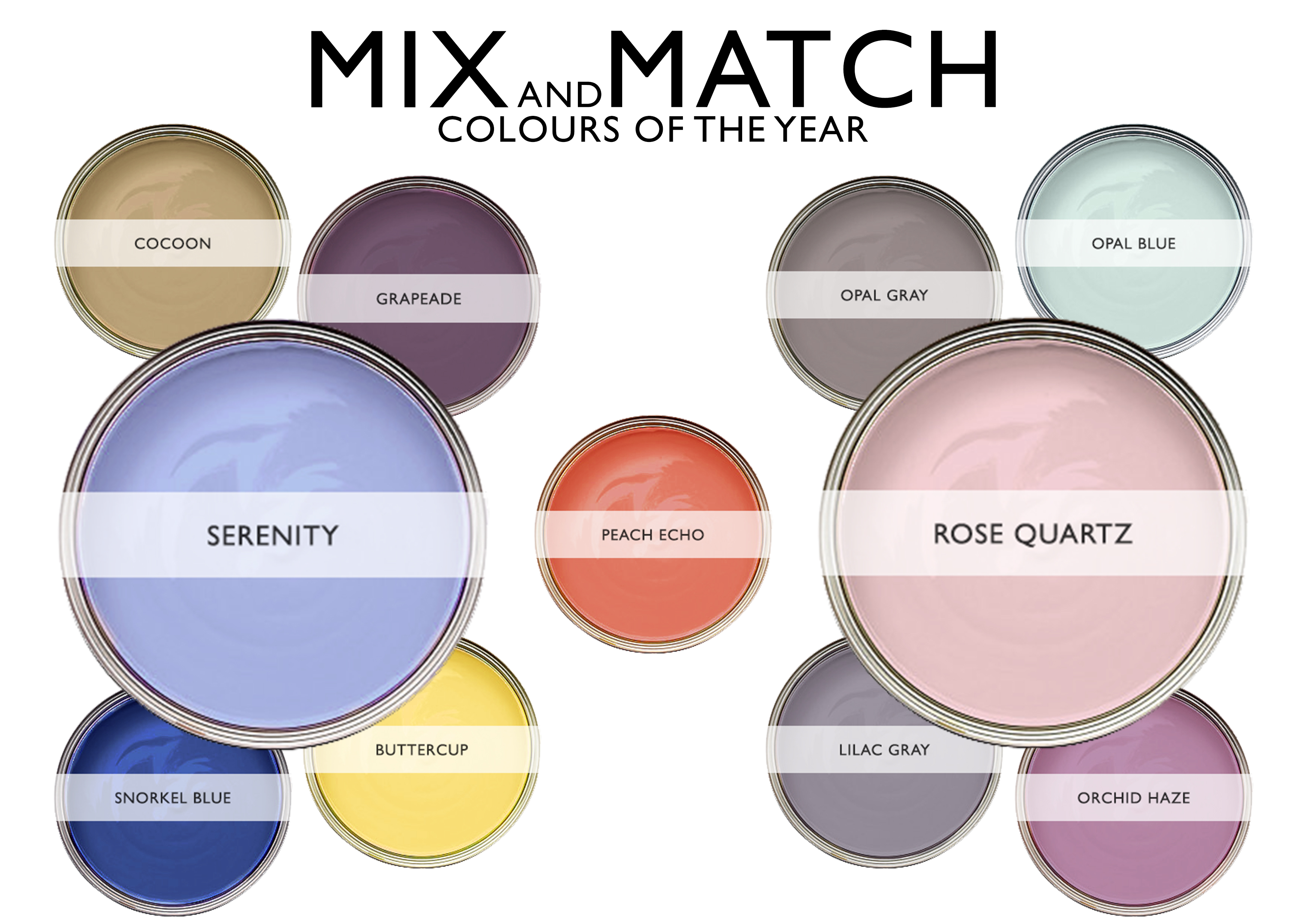
Because Pantone has selected two different shades for its 2016 Colour of the Year, it means there is more possibility to mix and match colour than ever before, creating even more opportunities for your home decorating ideas.
These two colours can easily be matched with mid-tones, like purple or green. To create a monochrome look, mix with grey or black and white; alternatively, if you are looking to add some zest and flair, they also go fabulously with a huge range of yellows and pinks.
This can be complemented wonderfully by lending a little glam to your interior with some warm metallic frames on geometric furniture; warm metal tones, such as copper, are still very much in style and show no sign of becoming a rusting trend any time soon.


[ezcol_1half]
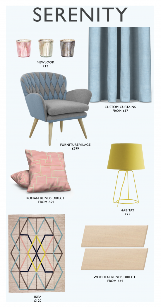
Peace and repose are the adjectives surrounding Serenity. This really is the perfect colour for achieving a tranquil and airy vibe, in the most fabulous way possible. The cooler shade of the two, this soothing blue tone is perfect for creating a traditional French motif in the home, especially when matched with steel lamps, chandeliers and steel framed mirrors.
Linen couches, complemented by real wood furniture, generate a rustic aesthetic in any interior, adding a chic and classic style to your rooms.
Not only is Serenity a beautiful standalone shade, but it allows you to mix and match an even greater range of different tones. Go deep with Snorkel Blue, or add an introspective air of solitude with the gentle colour of Cocoon. Why not lend some serious sunshine with Buttercup, evoking memories of childhood summertime?
The brooding shade of Grapeade is a fruitful addition to living rooms and bedrooms, only enhancing the overall tranquillity of an interior.
[/ezcol_1half]
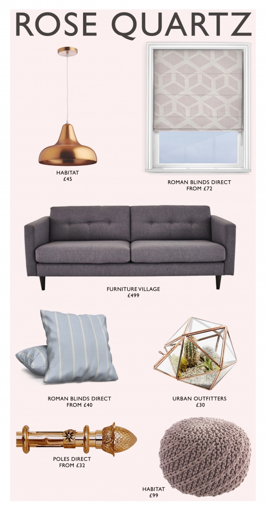
Create a warm, shabby chic look with Rose Quartz. This timeless aesthetic is easily achievable by blending this gorgeous shade of pink with other warm tones around the house, such as marble flooring, copper coloured furniture and woollen fabrics, all adding to the cosy and calm atmosphere.
Gentle tones of Opal Blue and Grey sooth your interior, creating a motif of tranquillity and style. There is also the option of Lilac Grey to add a slightly more purple tone to a room. Alternatively, you can go purple go all the way with Orchid Haze, which complements Rose Quartz beautifully, especially in living rooms and bedrooms.
[ezcol_end_right]

On the surface, Rose Quartz and Serenity are used for creating polar opposite atmospheres; whereas Rose Quartz’s gentle pink is a warm and compassionate colour, subtly making a home feel more vibrant and welcoming, Serenity is a cool and calm shade of blue, casting one’s mind to thoughts of the ocean and the open sky.
However, when combined, these two shades meld together to create a perfectly vivid vision of a dusky sky on a clear day – universally one of the most beautiful sights to behold, and one that looks breathtaking in any space, whatever your style. Both Rose Quartz and Serenity can be matched wonderfully with the optimistic and luxurious orange shade of Peach Echo, helping to gently fuse these contrasting tones, and adding to the dusky, mellow aesthetic.

Our interior stylists have been pinning! For more design ideas, home inspiration and information on Pantone’s colours of 2016, take a look at our Pinterest boards.
