AW16 Collection | Pantone Colour Report
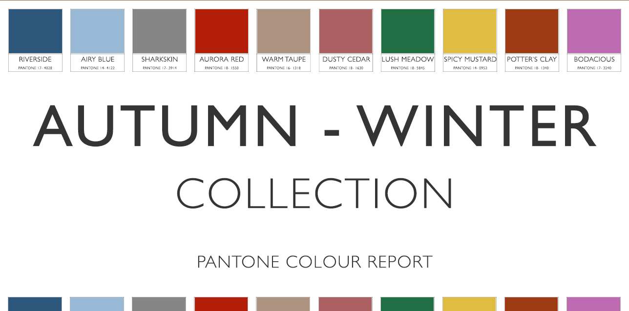
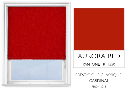
As the days begin to turn darker, so does our colour palette. Pantone’s Fall 2016 shades are a sedate shift from the bright and bold tones we brought to you throughout the spring and summer months. However, many of the new colours strongly reflect their spring counterparts, just in more subdued shades; the vivid tone of Fiesta Red has been replaced with the deep and romantic Aurora Red, while Spicy Mustard has substituted Buttercup.
This autumnal palette is stacked with an even more varied range of colour than our Spring-Summer Collection, and over the coming months we at Roman Blinds Direct will be showcasing each one in turn, providing room inspiration on how they can be incorporated into your autumn decor.
We will be taking an in-depth look at each of the ten colours in turn, exploring the potential room design ideas you can create with them, and how they can be best used in the home.
For the time being though, this week, we are merely going to briefly introduce you to Pantone’s top ten, must-have colours for autumn 2016. These are the very colours our interior designers took inspiration from when compiling our exclusive Autumn-Winter Collections 2016, and we hope they provide you with room inspiration for your own decor, too.
[ezcol_1half]
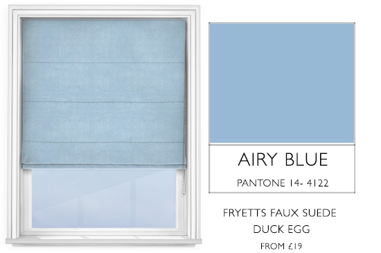
Airy Blue
Adding a mystical and airy dimension to a home, Airy Blue brings a weightless and refreshing edge, not unlike Pantone’s Colour of the Year 2016, Serenity, and can be paired with an eclectic mix of other shades.
[/ezcol_1half][ezcol_1half_end]
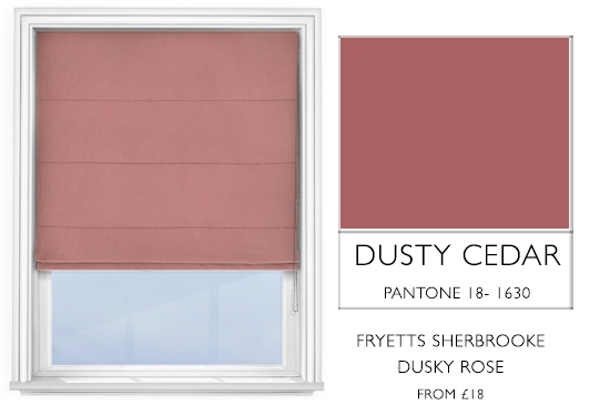
Dusty Cedar
Reminiscent of one of Pantone’s Colours of the Year 2016, Rose Quartz, Dusty Cedar is a duskier version of the pinks we see in spring.
Be sure to keep checking this page for room inspiration on how to use these colours. Our interior designers have been pinning! For more room design ideas that use colours and fabrics from our Autumn-Winter Collection, head over to our Pinterest page.
[/ezcol_1half_end]
[ezcol_1half]
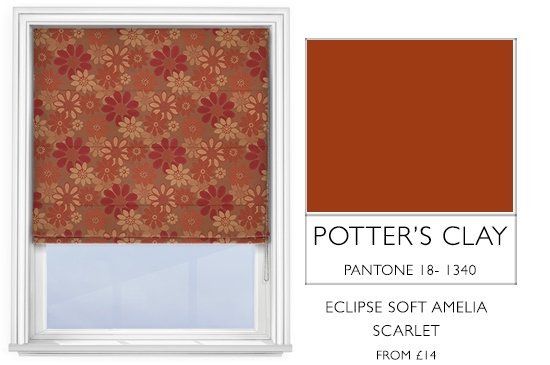
Potter’s Clay
The perfect, earthy base colour for autumnal room inspiration, Potter’s Clay provides a strong foundation to fashion a multitude of motifs around.
[/ezcol_1half][ezcol_1half_end]
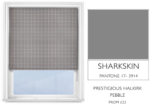
Sharkskin
Sharkskin is a modern and edgy shade which retains its neutrality, allowing you to mix and match practically any autumn colour.
[/ezcol_1half_end]
[ezcol_1half]
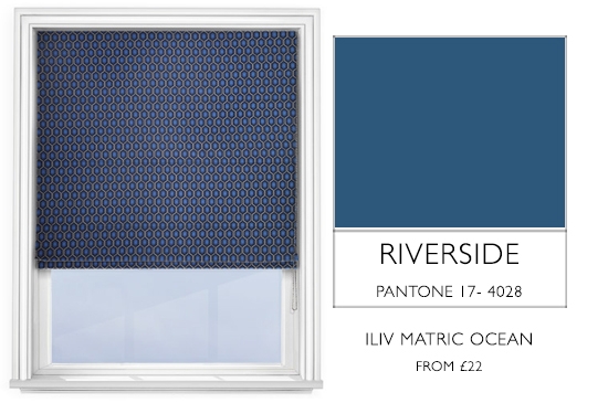
Riverside
Cool and soothing, Riverside is a strong blue tone that adds stability and contemporary refinement to any room.
[/ezcol_1half][ezcol_1half_end]
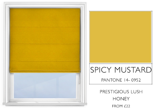
Spicy Mustard
An elegant and warming tone, it offers a spicier tint to your decor than its predecessor, Buttercup, lending an abstract and unexpected ambience.
[/ezcol_1half_end]
[ezcol_1half]
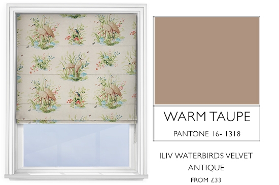
Warm Taupe
A stable shade of brown, Warm Taupe gifts an organic and grounded air to a home, providing a timeless base colour that can coordinate with a large range of tones.
[/ezcol_1half][ezcol_1half_end]
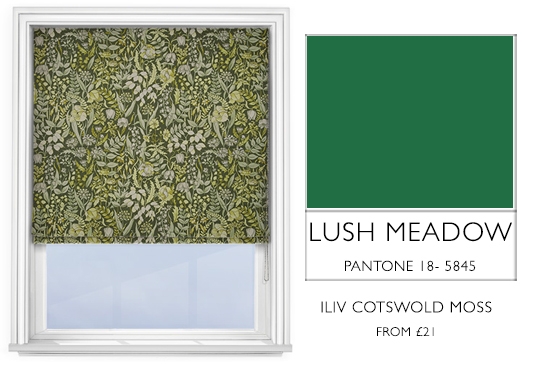
Lush Meadow
This fresh and sophisticated shade of green is a gorgeously deep tone, evoking images of fresh foliage and botanicals.
[/ezcol_1half_end]
[ezcol_1half]
Aurora Red
Sensual and bold, Aurora Red is an exciting and warm injection of passion into your decor, promising to get a fashionable pulse pumping in any home.
[/ezcol_1half][ezcol_1half_end]
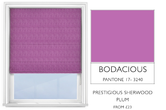
Bodacious
Bringing the femininity to this collection of colour, Bodacious is a vibrant and rich shade of purple, with subtle hints of pink.
[/ezcol_1half_end]
Be sure to keep checking this page for room inspiration on how to use these colours. Our interior designers have been pinning! For more room design ideas that use colours and fabrics from our Autumn-Winter Collection, head over to our Pinterest page.
